
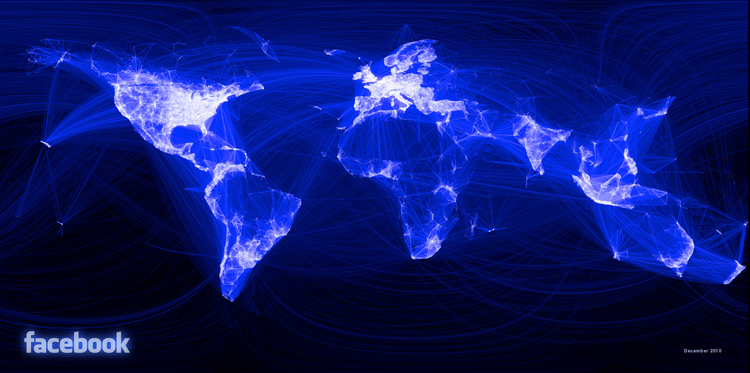
This one began with profile data from a scant 10 million people -- or about 2% of Facebook's users. Butler first tabulated the number of friends between each city, and what latitude and longitude each friend was at. Then, he created a color code: The more connections between two places, the lighter the line is; the fewer, the darker. What emerged, of course, is a map of the world unlike any other. That is, it's not a map of roads or internet connections or airplane routes -- but a map of human relationships. Our physical geography is simply an emergent quality.
No comments:
Post a Comment